Data Quilts: Exploring Environmental Data Through Textile Art
In her explorations of data physicalization on fabric, artist India Johnson asks the question: What happens if we can both see and touch data? This is a question that has guided my own work with data quilts. As a professor and researcher of both sustainable design and information design, I often find myself wading through graphs, charts, and various representations of environmental data. These are typically computer- or paper-based projects that offer up a sleek, tidy, and efficient way of thinking about environmental issues. These kinds of data visualizations are an important part of understanding the climate crisis and making scientific research more accessible to a broader audience; however, they often lack an emotional dimension. The climate crisis is something we feel and experience (some more than others) every day, and yet emotive elements don’t feel palpable in most computational data visualizations. So, can we engage with climate data in a different way? If we could touch data, how might it tug at our emotions? To explore these questions, I connected environmental data to quilting, a passion of mine that I have always found to be a deeply emotional and very human form of expression. In writing about data humanism, Georgia Lupi expresses this idea, suggesting that “we are ready to question the impersonality of a merely technical approach to data and to begin designing ways to connect numbers to what they really stand for: knowledge, behaviors, people.”
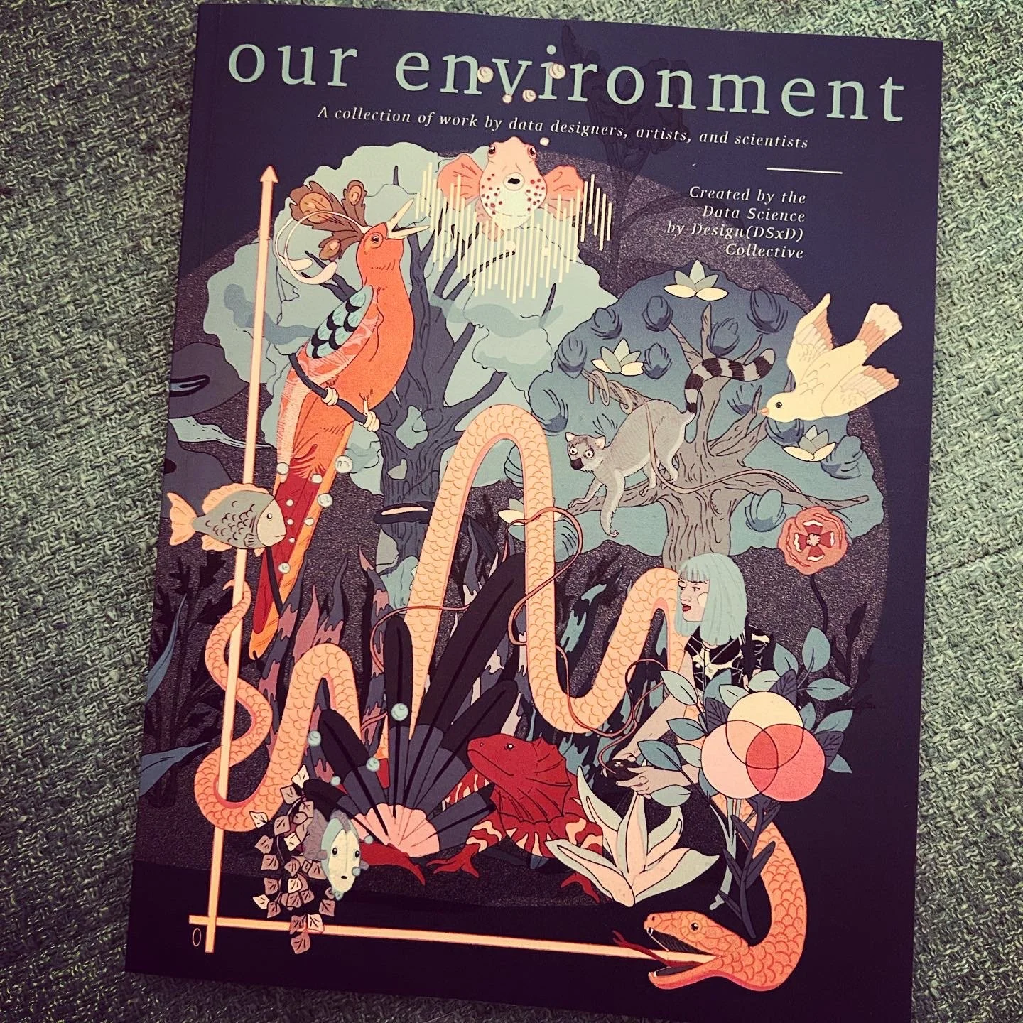
Writing in the second issue of Data Science By Design: Our Environment, I explore my data physicalization project about space junk.
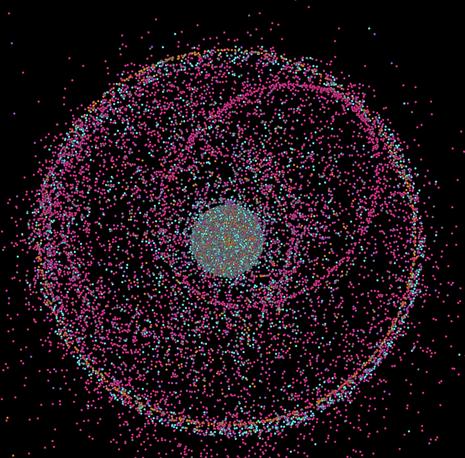
NASA tracks over 26,000 pieces of space junk, including satellites, rockets, and various detritus from the space program.
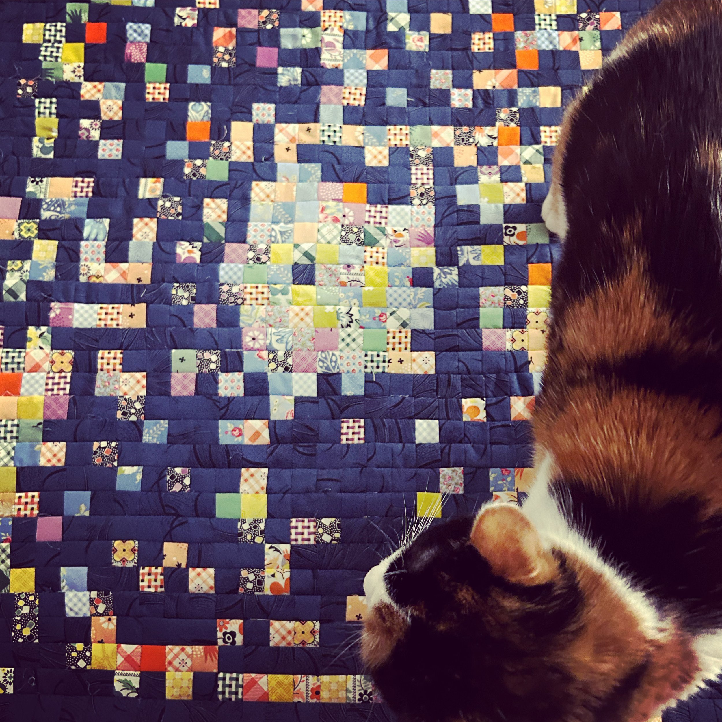
My data quilt maps this data to different colors and fabric styles from the various decades of the space program, from the 1960s to today.
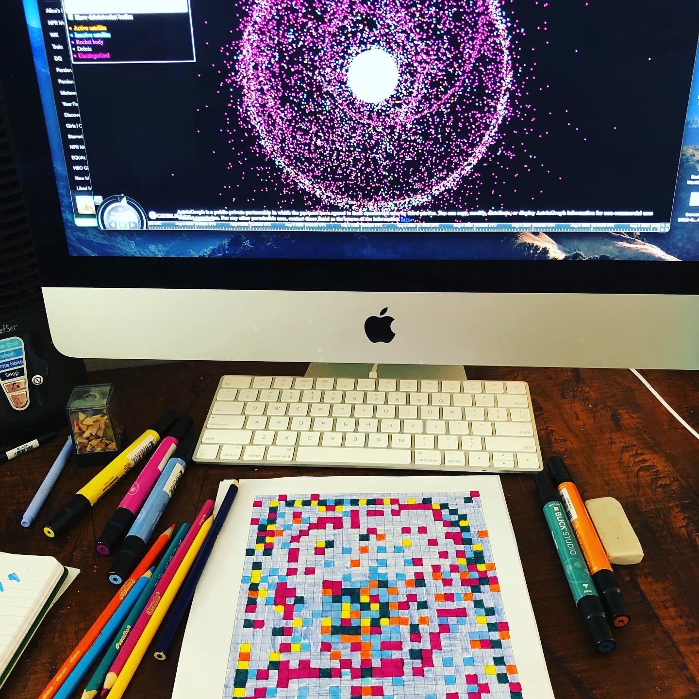
Translating the data from NASA into a quilt pattern.
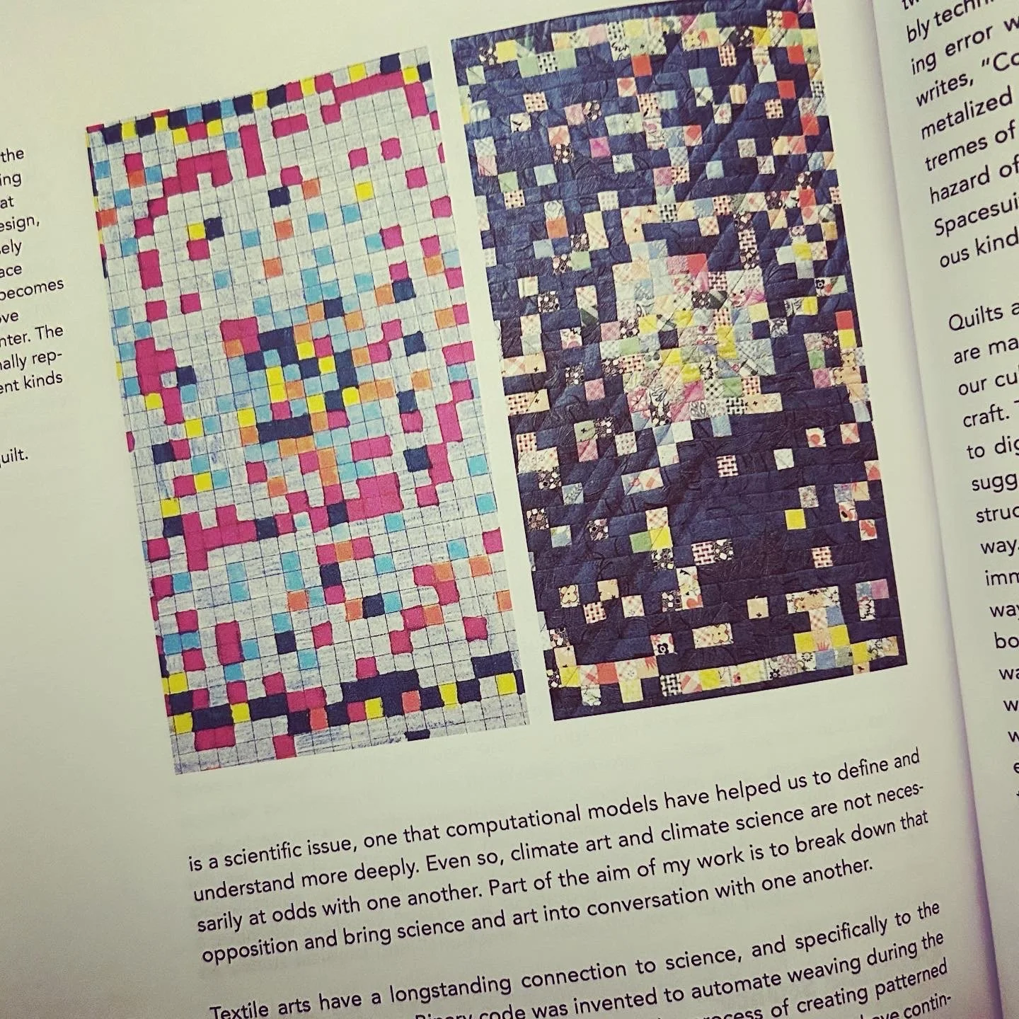
The quilt next to the pattern in the print issue of Data Science by Design.